

Photos
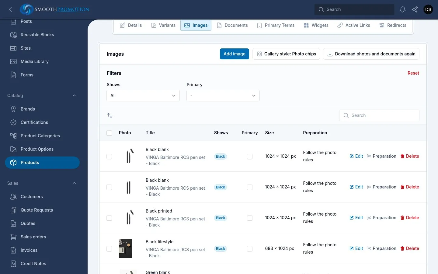
The Images tab of a product holds its photos, in the order the gallery shows them. Drag rows to reorder. Every change saves at once, separately from the rest of the product. Photos are the same on every site.
Use Add image to upload one. Each photo has:
| Field | What it does |
|---|---|
| Title | Required. |
| Alt Text | Describes the photo for screen readers and search engines. |
| Shows | What it is a photo of. See tagging. |
| Primary Image | The one photo shown for the product in lists. |
The upload also has an image editor. The edit window shows the photo’s size and how much white space it has.
Feed products get their photos from the supplier. A banner above the table says if a download is waiting, running or failed, or if the supplier has none. Download photos and documents again fetches only what is missing, and never replaces what the product has. See photo rules.
Some supplier photos have a licence end date, shown with the photo’s size. This is a record only: nothing removes the photo when it ends.
The primary photo
Section titled “The primary photo”The primary photo is what the product shows on its card, in search and in lists. Tick Primary in the table. Ticking one unticks the others. With none ticked, the first photo is used.
To reset it for many products, tick them on the product list and use Pick the primary photo again. It picks by the photo download rules: a primary rule, else the supplier’s main photo, else the first. This replaces one chosen by hand.
Tagging photos by colour
Section titled “Tagging photos by colour”Shows ties a photo to option values, so the product page can show the right photo when a customer picks a colour.
| Shows | The photo appears |
|---|---|
| Nothing (All options) | For every choice |
| Black | When Black is chosen, at any size |
| Black and Matte | Only when both are chosen |
Rules:
- Only options that change the photos can be used (colour and text swatches, not Size). See option kinds.
- Only values this product’s variants use are offered.
- At most one value of each option: a photo cannot show two colours.
To tag several at once, tick them and use Set what they show. The field only appears on a product with such options. The Shows filter lists the photos tagged with one value.
A category page’s colour chips use this too: clicking a chip on a product card shows that product’s first photo tagged with that colour.
Gallery style
Section titled “Gallery style”The Gallery style button above the table names the current style and changes it. It saves at once. For many products, use Set gallery style on the product list.
| Style | What the product page does | Suits |
|---|---|---|
| Colour chips | Colour dots. Every photo stays in the gallery, and choosing a colour shows its photo. | One photo per colour |
| Photo chips | Each colour is shown by its photo, and choosing one shows only its photos (and those for every colour). | Several photos per colour |
A new feed product takes the style its feed uses. A product entered here starts on colour chips.
Photo preparation
Section titled “Photo preparation”Preparation on a photo’s row decides how its sizes are made from the original, with a before and after preview.
| Choice | Meaning |
|---|---|
| Follow the photo rules | The default. Says which rule applies now. |
| Use it as it is | No changes. |
| Its own steps | Steps for this one photo. |
Save and remake its sizes applies it straight away. The original is never changed. The rules themselves are on photo rules.
Which size appears where
Section titled “Which size appears where”The templates ask for a photo by what it is for, and each site’s theme says which size that uses. This is set by a developer, in the theme, so one photo can be sized differently per site.
| Role | Used for |
|---|---|
| Thumb | Gallery thumbnails, photo chips, the quote cart, search suggestions |
| Grid | Product cards in lists and grids |
| Main | The product page’s main photo |
| Zoom | The photo zoomed into on the product page |
| Share | The image used when the page is shared on social media |
| Feature | A product shown alone in a feature, such as a help card’s featured product |
Category images are separate: see categories.