

Widgets
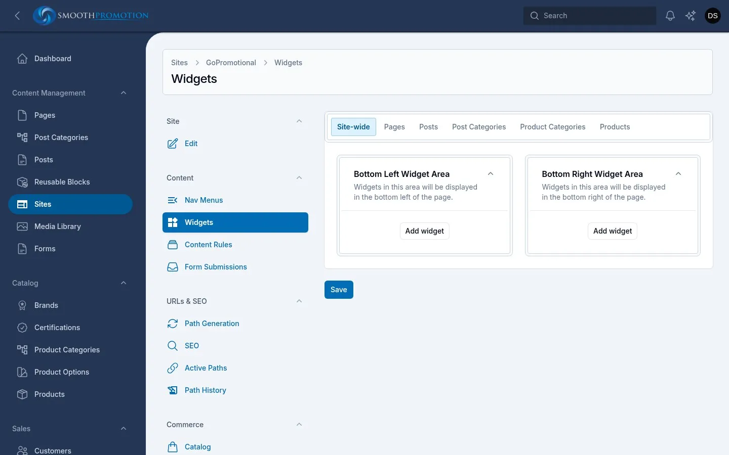
Widgets are self-contained pieces you can drop into a page’s frame: banners, help cards, reviews, a list of links. The theme decides where they can go (its areas), and you decide what goes there. Each widget belongs to one site.
There are two places to place them:
- The site’s Widgets page: its site-wide areas, and the defaults for each type. Needs site rights.
- An entry’s Widgets tab: that one page, post, product or category. Available to whoever can edit the entry, and only for sites it is live on. A draft has nothing to place yet.
In either place, use Add widget in an area, choose a type and fill it in. Widgets in an area stack in order, and you can drag them. Press Save on the site’s page, or Save widgets on an entry’s tab: this form saves on its own, separately from the entry.
| Type | Area | Where it shows | Fallback |
|---|---|---|---|
| Site-wide | Bottom Left, Bottom Right Widget Area | A two-column row under the footer menus | None |
| Page | Above Content, Below Content | Around the page’s content | Default |
| Page | Sidebar | The sidebar, below its menus (Sidebar layout only) | Default |
| Post | Sidebar | The post’s sidebar (Sidebar layout only) | Default |
| Post Category | Category Banner | The top of the category page | Inherit |
| Product Category | Category Banner | The category’s header, beside its description | Inherit |
| Product Category | Beside Description | Under any banner, in the same place | Inherit |
| Product Category | Below Content | Across the page under the products | Inherit |
| Product | Under the Photos | With the product’s sections under its photos | Default |
| Product | Below Content | Across the page at the foot of the product | Default |
Both themes have the same areas. Placements are per theme: after switching a site’s theme, the new theme’s areas start empty unless it has been set up before, and the old widgets come back if you switch back. The Widgets page always edits the theme the site has saved.
Defaults and inheritance
Section titled “Defaults and inheritance”Setting a widget on every product by hand would be hopeless, so areas marked Default or Inherit above have a fallback. On the site’s Widgets page, each type with such areas has its own tab (Pages, Posts, Post Categories, Product Categories, Products). Whatever you place there shows on every entry of the type on that site, new ones included, unless the entry says otherwise.
On an entry’s Widgets tab, pick a tab for the site, and each such area offers three choices:
| Choice | What shows |
|---|---|
| Use the default (or Inherit, in an Inherit area) | The fallback. A note says what that is and where it comes from. |
| Own widgets | This entry’s own widgets, which replace the fallback entirely. |
| Hide here | Nothing, whatever the fallback has. |
The search for what to show stops at the first place that has anything, and doesn’t merge:
- Default areas: the entry, then the type’s default for the site.
- Inherit areas: the entry, then its parent categories on that site, nearest first, then the type’s default. Choosing Hide here on a category also stops its subcategories inheriting anything from higher up, since they see it as the nearest parent with something placed.
A parent that isn’t on the site is skipped, so its banner can’t reach a child on that site.
Widget types
Section titled “Widget types”A block of raw HTML. HTML is pasted in as it is, so it can include anything, including something that breaks the page. Check it on the site.
Image Banner
Section titled “Image Banner”A banner image: Image (required), Link URL and Alt text. Sizes for different screens are made automatically from the upload, and an SVG is shown as it is.
Help Card
Section titled “Help Card”A person to talk to, for beside a description or in a sidebar.
| Field | What it does |
|---|---|
| Note, Heading (required), Text | The wording. The note is a short line above the heading. |
| Photo, Name, Role | The person. |
| Show the page’s featured items | On a category page, the card turns one at a time to up to three of the products featured in it, then back. Only when it has some live on the site. |
| Label on featured items | A short line above each, such as “Best seller”. |
| Reasons to get in touch | Up to four short lines. |
| Show the site’s phone and email | Taken from the site’s primary contact, not typed in, so they follow any change. |
| Opening hours | A short line. |
| Button label, Button link | The button shows only with both. The link is a path on the site or a full address. |
Nav Menu
Section titled “Nav Menu”One of the site’s menus as a plain list of links, even if it is a mega menu in the header. Choose the Menu, a Heading (None, Menu name or Custom) and what to Show (All levels or Top level only). Edit menu opens the menu. If the menu is deleted, the widget shows nothing.
Reusable Block
Section titled “Reusable Block”Places a reusable block. You edit the content on the block itself (Edit block opens it), and the same block can be placed on any number of sites. A disabled or deleted block shows nothing.
A short process in numbered steps, such as what happens after a quote request. Heading (required), Intro, Link label and Link (no link without one), and Steps: two to six, each with a Title and Text. It shows as a row joined by arrows, or a list where it is narrow.
One to three cards side by side, for promises such as a price match. Each has a Heading, a Header colour (Primary, Secondary or Accent), a bold Lead, Text, up to four Points (a one or two character Symbol such as £, a Title and Text), and Signed by: Name, Role, Photo and Signature. Photos and signatures are shown as uploaded, so use a transparent background.
Featured Post Category
Section titled “Featured Post Category”Highlights one post category with a link to its page. Post Category lists those the site carries.
Reviews.co.uk reviews
Section titled “Reviews.co.uk reviews”The business’s company reviews, in a row that scrolls sideways, with a link to them all.
| Field | What it does |
|---|---|
| Reviews.co.uk store | The store’s name in its Reviews.co.uk address. |
| Heading, Intro | The wording above. |
| Reviews shown | 4, 8, 12, 16 or 20. |
| Fewest stars shown | Lower-rated reviews are left out, as are those with no comment. |
Reviews are fetched in the background and refreshed hourly. A new store’s widget shows nothing until the first fetch has finished, so give it a little time.
Related products
Section titled “Related products”On a product’s page, other products in a row that scrolls sideways. Made to be set once as the product type’s default, as each product then shows its own.
| Field | What it does |
|---|---|
| Products | Similar: from its category, Goes with it: from the categories its category pairs with, or Both: similar and goes with it, taking turns. |
| Heading | The wording above. |
| Products shown | The most to show: 4 to 24. |
Pairings are set on the category (“Pairs well with”, see categories). Without any, Goes with it shows nothing and Both shows similar products only.
Product notes
Section titled “Product notes”Notes written once and shown on every product they fit, such as care instructions. Also made to be a type default. Each note has a Heading, Text, and two conditions: Field sets (only products of these kinds) and Categories (only products in these or below them). Empty means any. A line under each note says what it reaches as you change the conditions. A product gets every note that fits it, and notes with the same heading share one section.